

Description
Step into the role of a hospital janitor armed with an arsenal of anti-bacterial guns, defending against relentless waves of human-sized germs. Battle through chaotic hospital wings, unlocking new areas, upgrading your weaponry, and boosting your abilities with candy bars from vending machines scattered throughout the mayhem. Germageddon delivers an addictive mix of strategy and survival with its fast-paced, round-based first-person shooter gameplay.
Role & Context
- Team Project
- Period: Third University Year (2024)
- No Brief
- 2 Programmers, 2 Artists, & Me (UI Designer, UI Artist, Game Designer)
(Click Images to Expand)
UI/UX Process
Brief Review
Germageddon started as a group project with full creative freedom. We reimagined Call of Duty Zombies for a younger audience by replacing zombies with germs and guns with liquid shooters. The UI would need redesigning to cater to this demographic, beginning with a mind map as part of my usual process.
The mind map explored common UI elements for each genre, such as crosshairs for shooters or round-timers for round-based games.
This led to the following key points:
First Person Shooter
- Clarity of Input (Inputs should have clear outcomes, like knowing exactly where shots will land)
- Stat Awareness (Key stats like health and kills must always be visible)
Younger Target Audience
- Instant Feedback (Quick, engaging feedback keeps younger players interested)
- Extra Assistance (Tutorials help younger players learn the game quickly)
- Good Navigation (Simple navigation avoids frustration and keeps players engaged)
Fast Paced Gameplay
- Instant Feedback (HUD/UI should deliver rapid feedback without disrupting gameplay)
- Gameplay Focus (Compact, intuitive HUD minimizes distractions during fast gameplay)
Round Based Gameplay
- Progress Knowledge (Players need clear progress indicators to feel accomplished)
(Click Image to Expand)
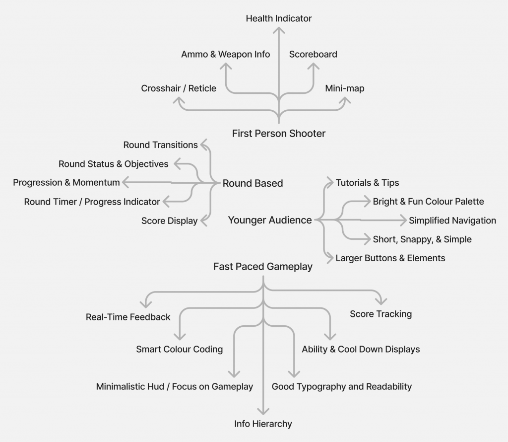
Mind Map
Requirement Analysis
After mind mapping, I conducted a requirement analysis for the project, as outlined below:
(Click Image to Expand)
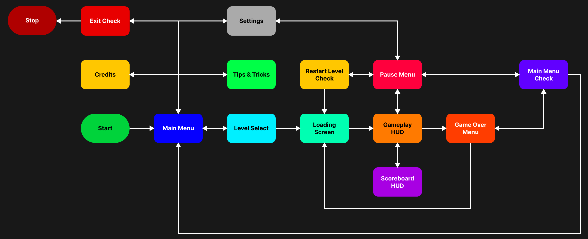
Flow Diagram
Feature List
Mood Boarding
After completing the requirement analysis, I moved on to mood boarding. This focused mainly on the theme of the Main Menu, which I envisioned as a hospital walkthrough, with different hospital elements representing each menu.
Sketching
After mood boarding, I sketched my vision for the hospital walkthrough menus and the in-game UI. This helped me communicate my ideas clearly to the team and also allowed me to identify any additional decorative UI elements that might not have been considered in the requirement analysis.
(Click Images to Expand)
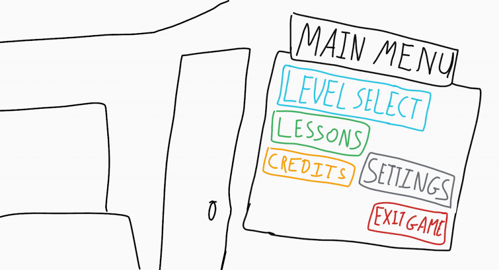
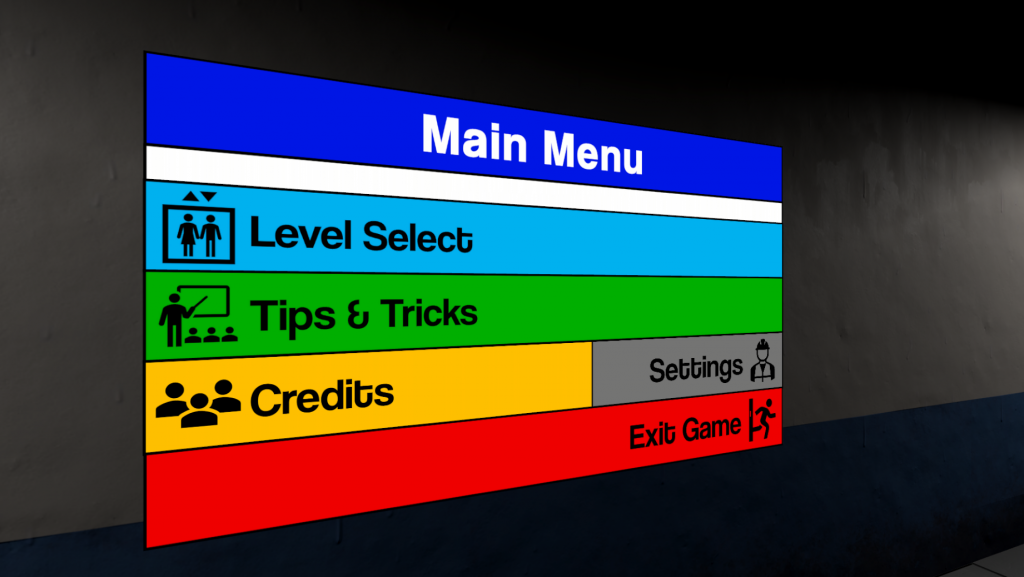
Main Menu
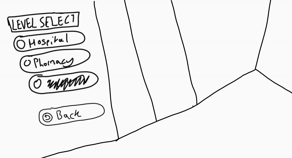
Level Select
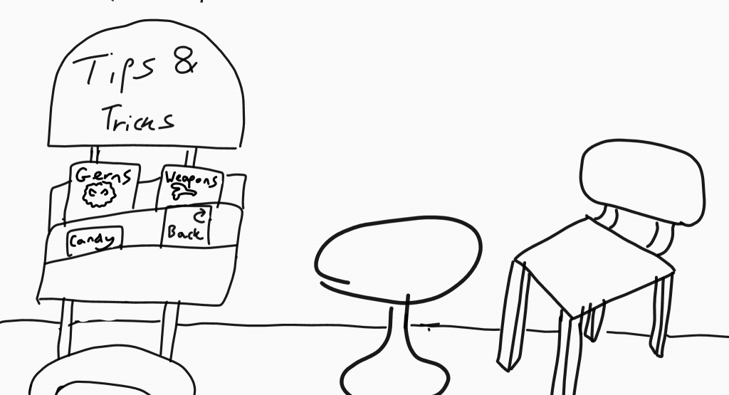
Tips & Tricks
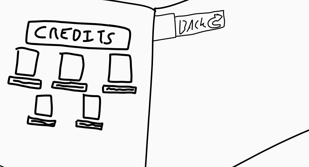
Credits
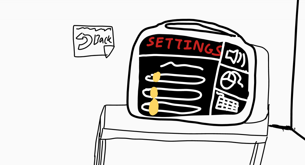
Settings
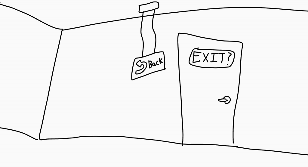
Exit Check
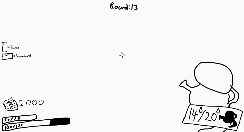
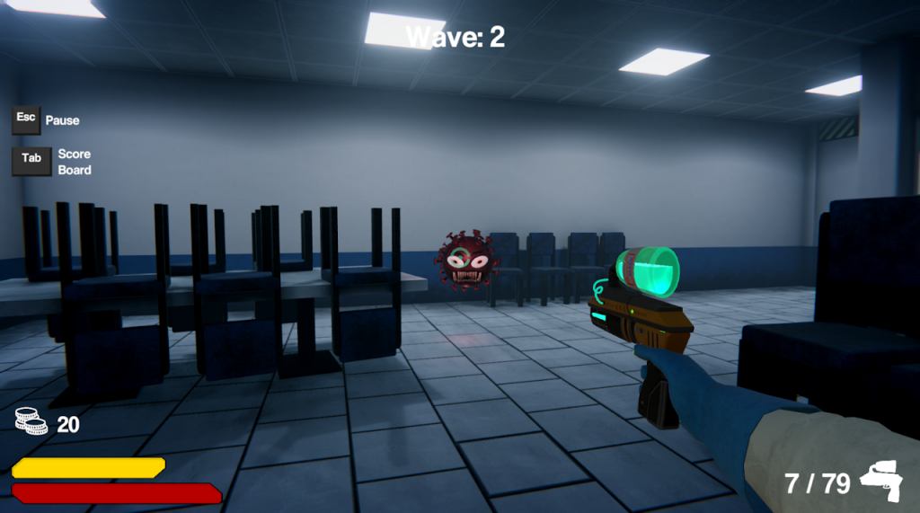
In-Game HUD
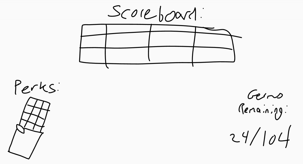
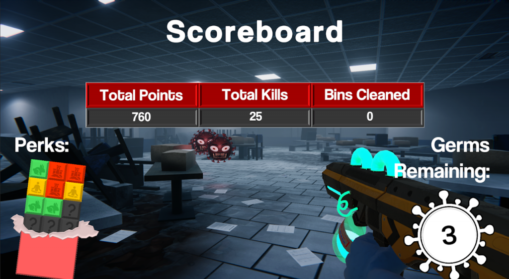
Scoreboard
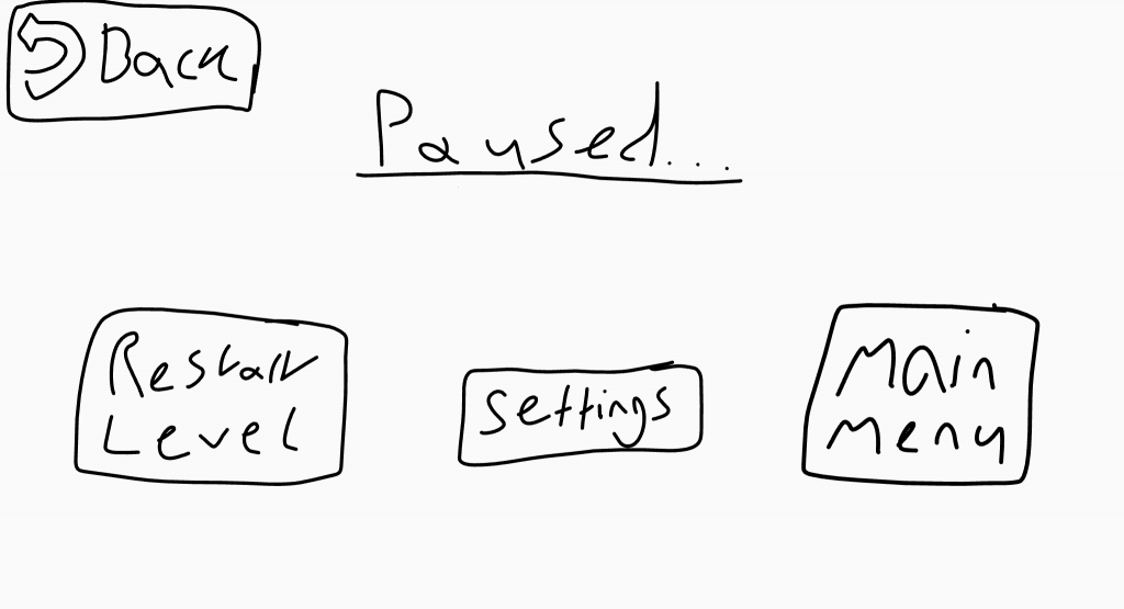
Pause Menu
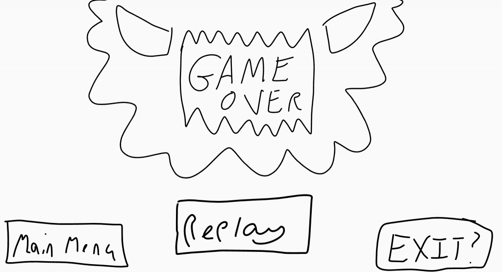
Game Over Menu
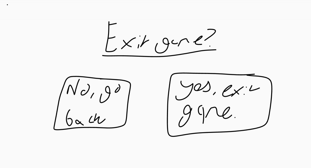
Exit Game Check
Prototype
After sketching, I created the prototype. This fully interactive walkthrough included all the finalized UI elements, with early gameplay in the background. Some of the colors used in the elements will be adjusted in the final version.
Final Result
Overall, I was quite satisfied with the readability and user-friendliness of the Germageddon UI, particularly the main menu navigation and the hospital walkthrough it represents. However, I felt that the in-game menus and HUDs didn’t meet the same standard.
Achievements
- Immersive Main Menu Navigation
- Clear & Accessible UI
Shortcomings
- No In-Game Menu Moodboarding
- Lack of 3D Models in Main Menu
- In-Game Menu Felt Generic