
Description
Set in a volcanic cave, the player must escape flowing lava, collecting gems along the way. Unlike typical endless runners, “Lava Rama” does not increase the player’s speed but instead progressively increases difficulty with harder obstacles. Players collect dynamite as these harder obstacles are dished out, allowing them to blow up obstacles in their way tactically. This adds a layer of strategy and resource management, allowing for a unique but tame twist on the typically simple endless runner genre.
Role & Context
- Team Project
- Second University Year (2023)
- “Into the Darkness” themed Endless Runner brief
- 2 Programmers, 2 Artists, & Me (UI Designer, UI Artist, Game Designer)
(Click Images to Expand)
UI/UX Process
Brief Review
After receiving the brief, I created a mind map exploring the ‘Endless Runner’ genre and the ‘Into the Darkness’ theme provided to me and my team.
This led me to four aspects to consider:
Fast Paced Gameplay
- Simplicity & Clarity (So HUD elements can be read quickly)
- Smart Hud Placement (So user’s eyes do not have to go far for information)
- Responsiveness (So users are aware that their actions are having an effect)
Dark Atmosphere
- No Bright Colours (To ensure immersion is kept)
- Clarity (So the UI is visible, even within a dark environment)
Mobile & PC Devices
- Touchscreen & Mouse Interactions (To ensure usage is possible on most devices)
- Keyboard Prompts (For ease of use if a mouse is not preferred)
- Simple Directions (So minimal inputs are required for touchscreen)
- Larger Buttons (For reduction of accidental taps)
Younger Audience
- Simplification (For ease of understanding)
- Reduction of text (So younger users do not get bored)
- Variation of Colour (To keep the audience drawn in)
- Fun Design (To keep users engaged, even out of gameplay)
- Larger Buttons (For smaller hands that may be more clumsy)
(Click Image to Expand)
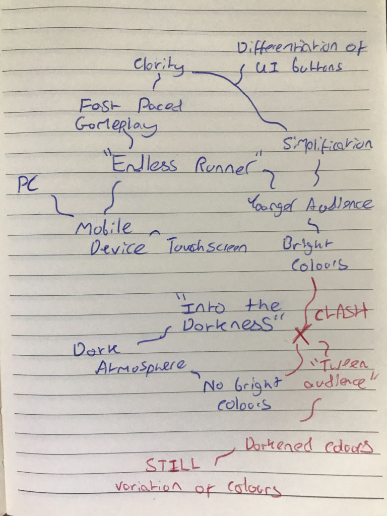
Mind Map
Requirement Analysis
After mind mapping, I had a clear idea of the type of UI I would create. Next, I focused on outlining the requirements before diving into the design process. I started with a flow diagram to map out the structure, followed by a detailed feature list. This approach ensured that no essential UI elements were overlooked during the design phase.
(Click Image to Expand)
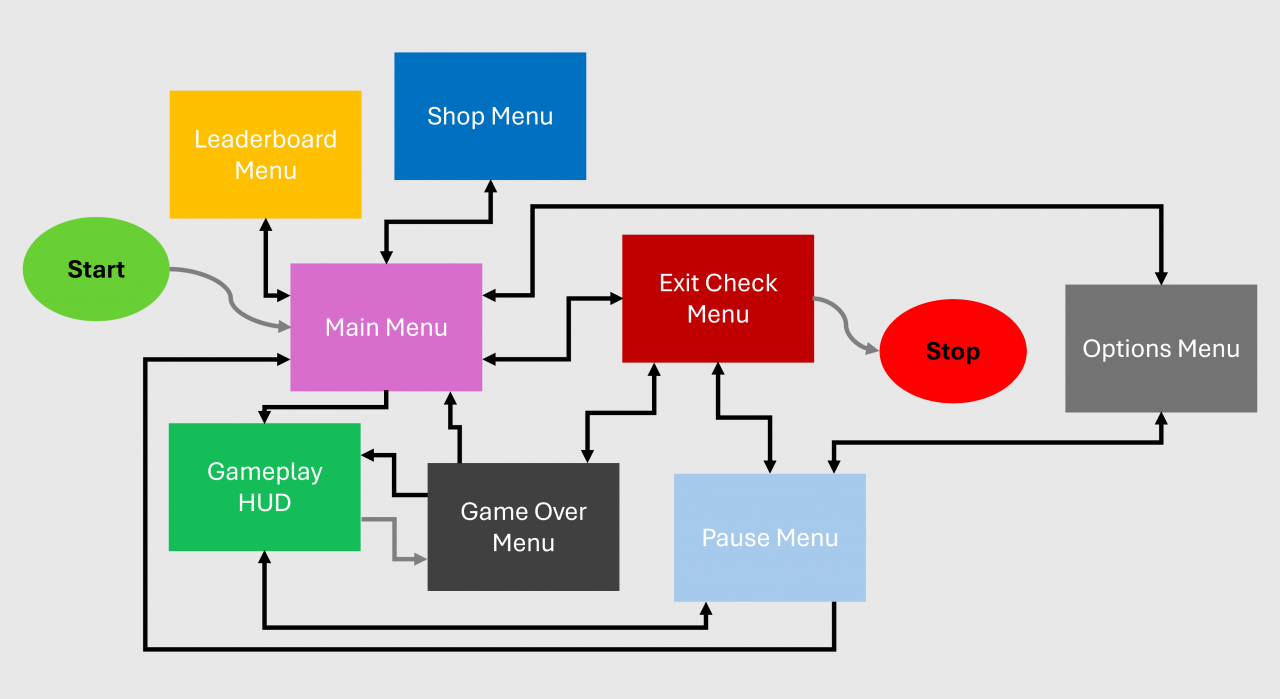
Flow Diagram
Feature List
Sketching
After fully reviewing the brief and realizing the requirements, I created a few digital sketches of each screen’s layout, including variations, to allow my team to decide on their preferred design.
(Click Images to Expand)
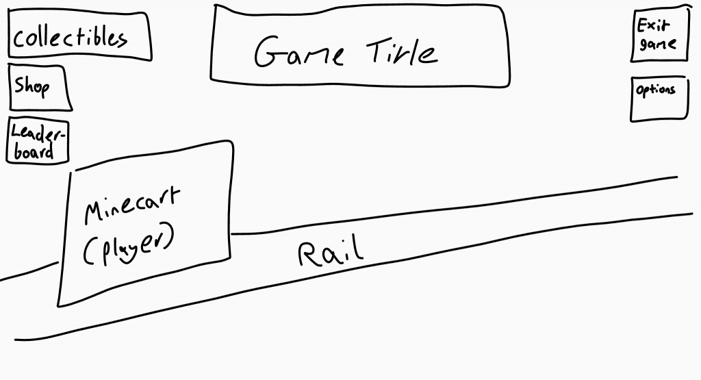
Main Menu
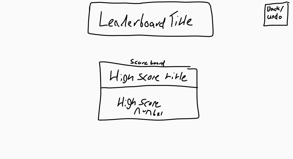
Leaderboard
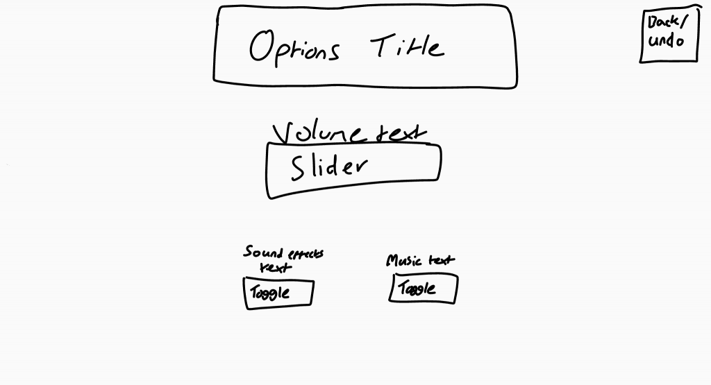
Options
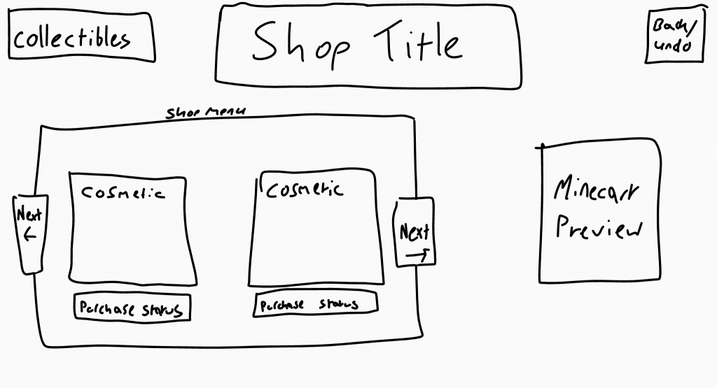
Shop 1/2
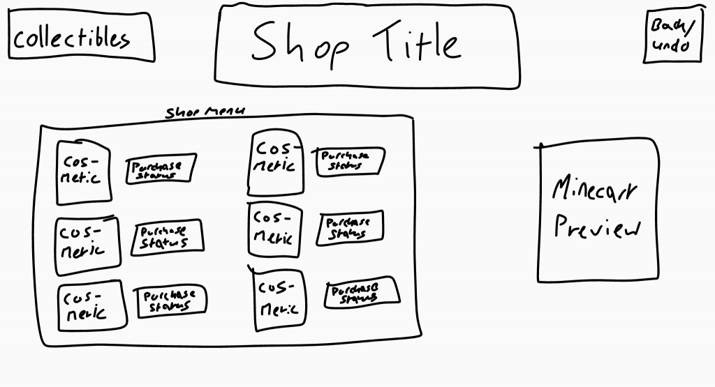
Shop 1/2
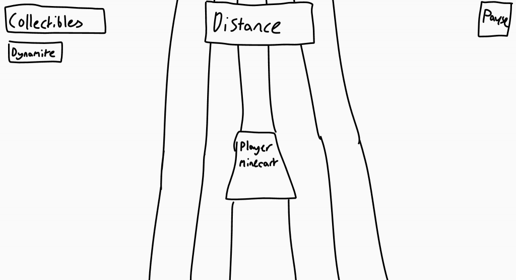
Gameplay HUD 1/3
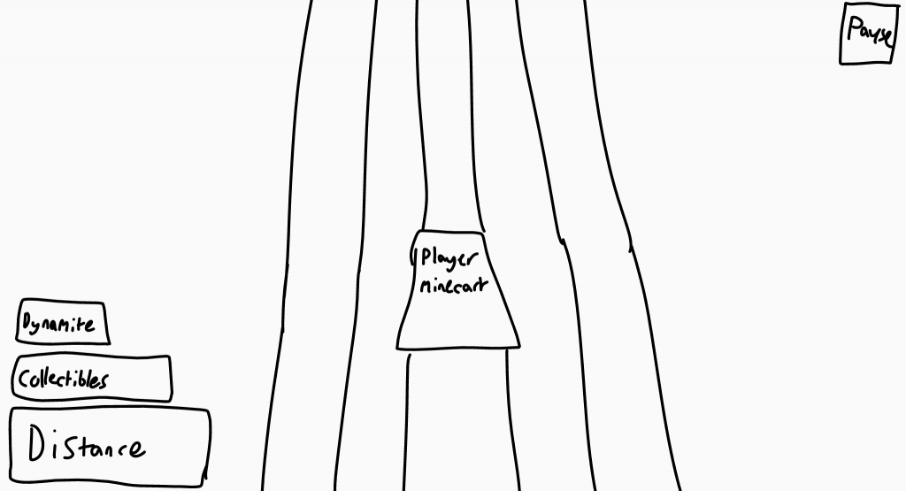
Gameplay HUD 2/3
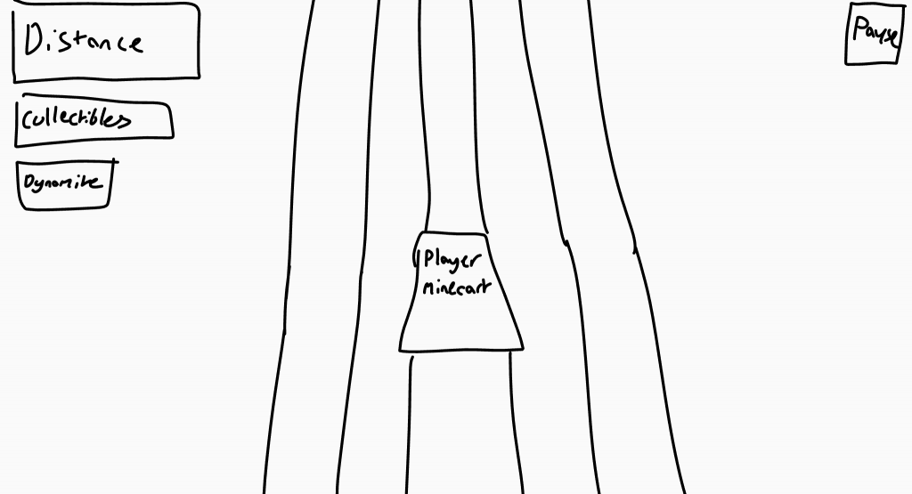
Gameplay HUD 3/3
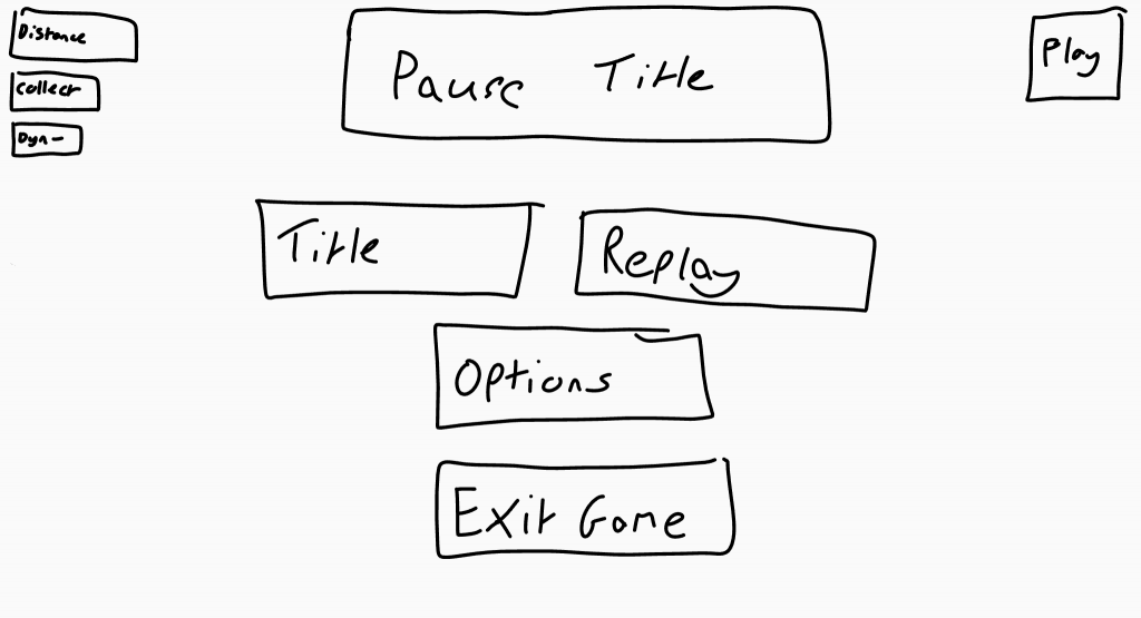
Pause Menu 1/3
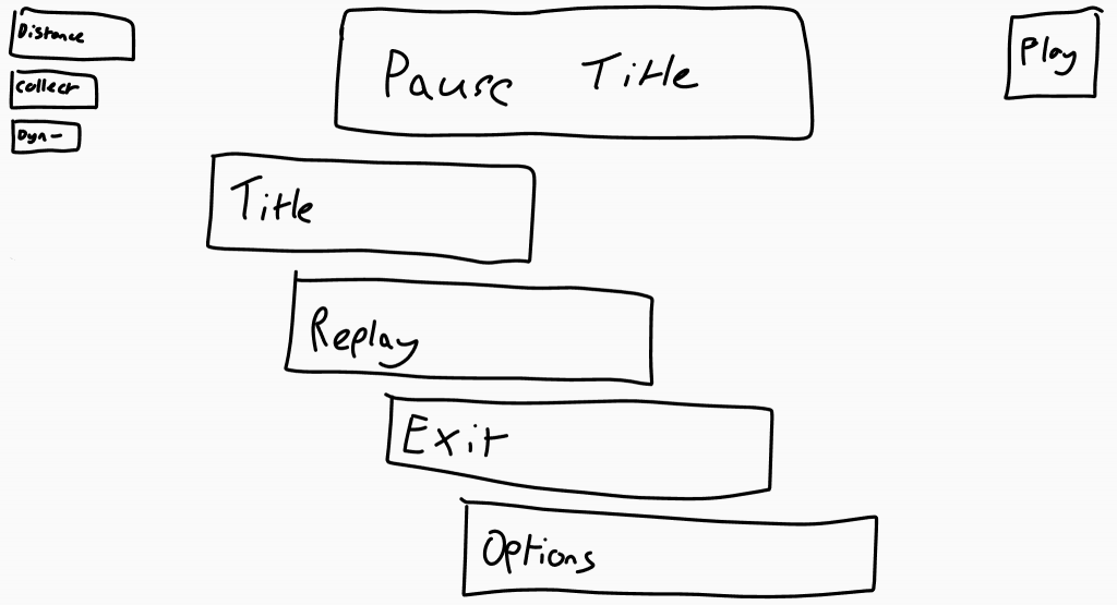
Pause Menu 2/3
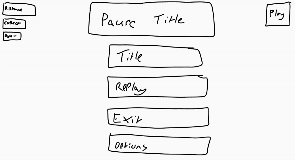
Pause Menu 3/3
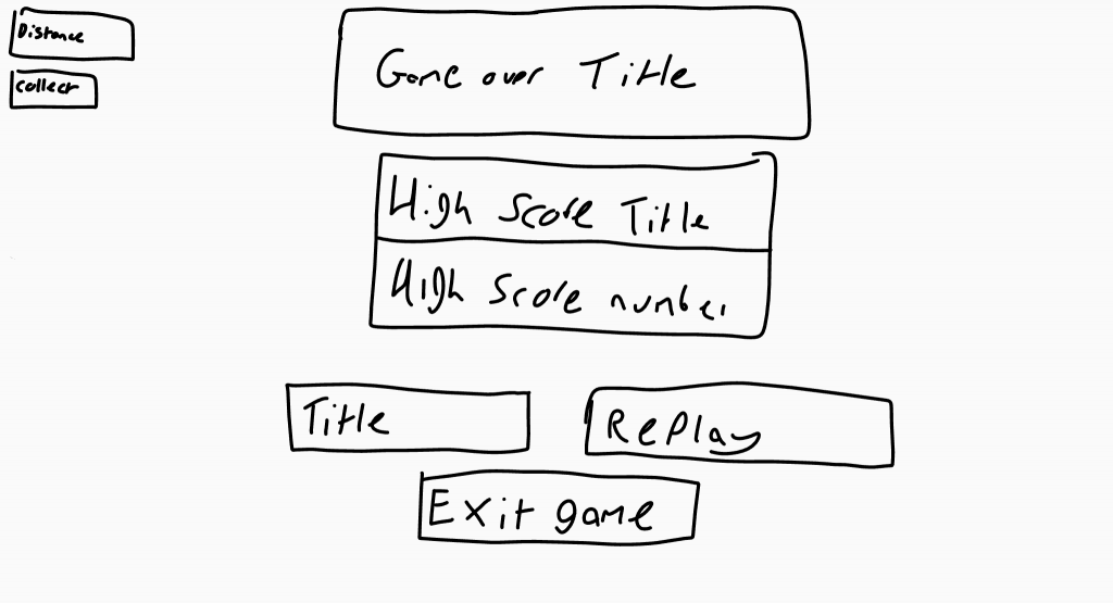
Game Over Menu 1/2
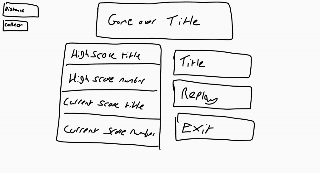
Game Over Menu 2/2
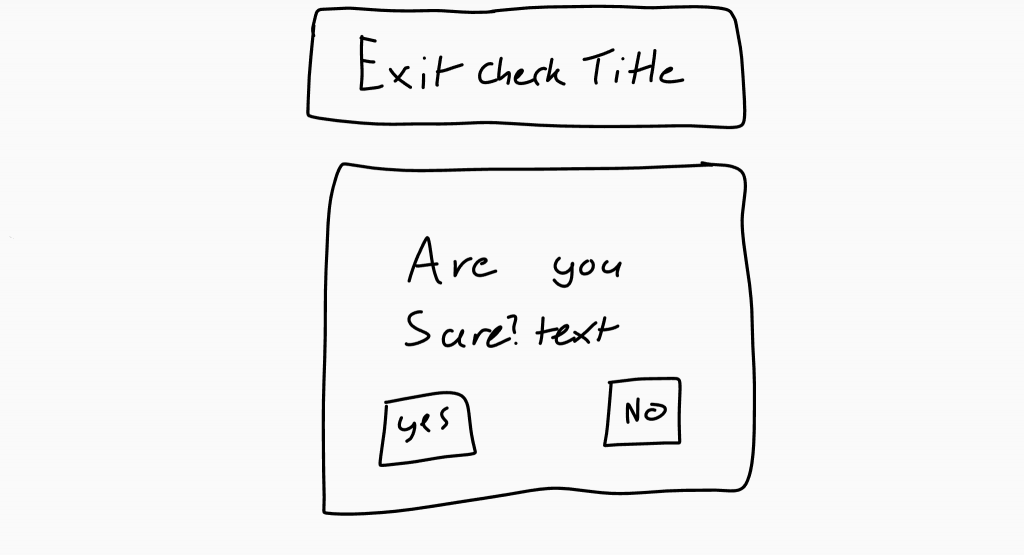
Exit Check Menu
Prototype
After fully reviewing the brief and realizing the requirements, I created a few digital sketches of each screen’s layout, including variations, to allow my team to decide on their preferred design.
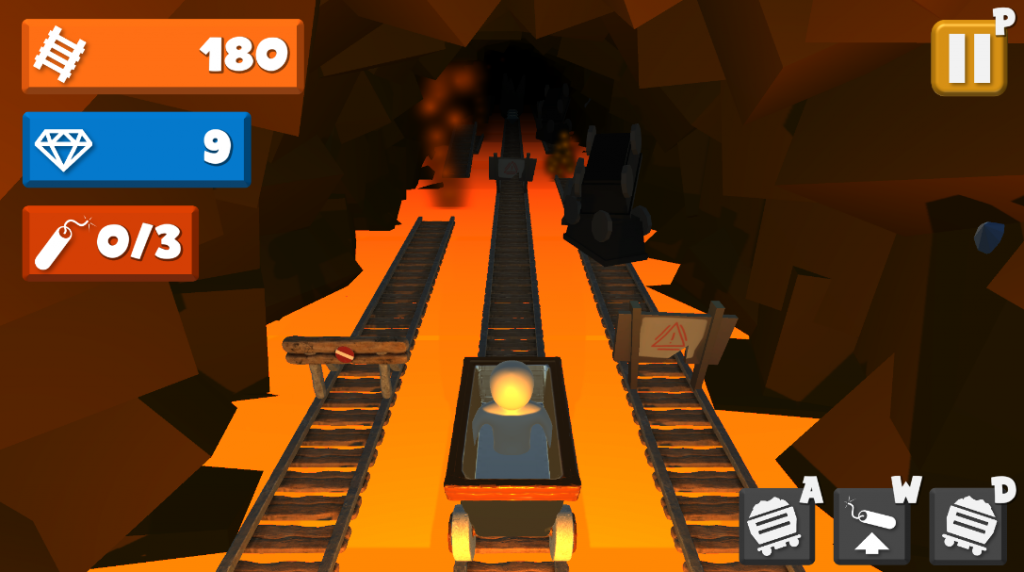
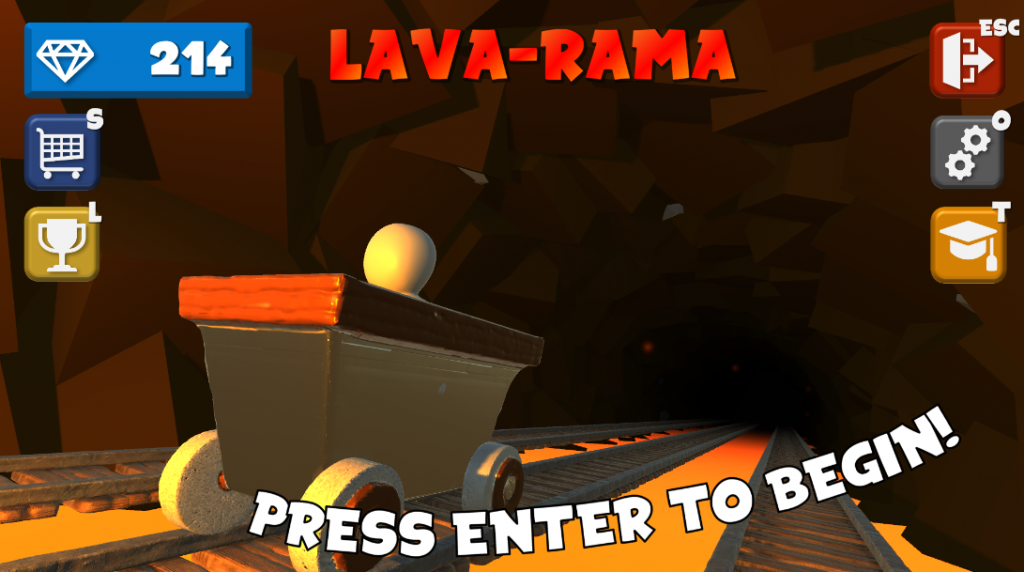
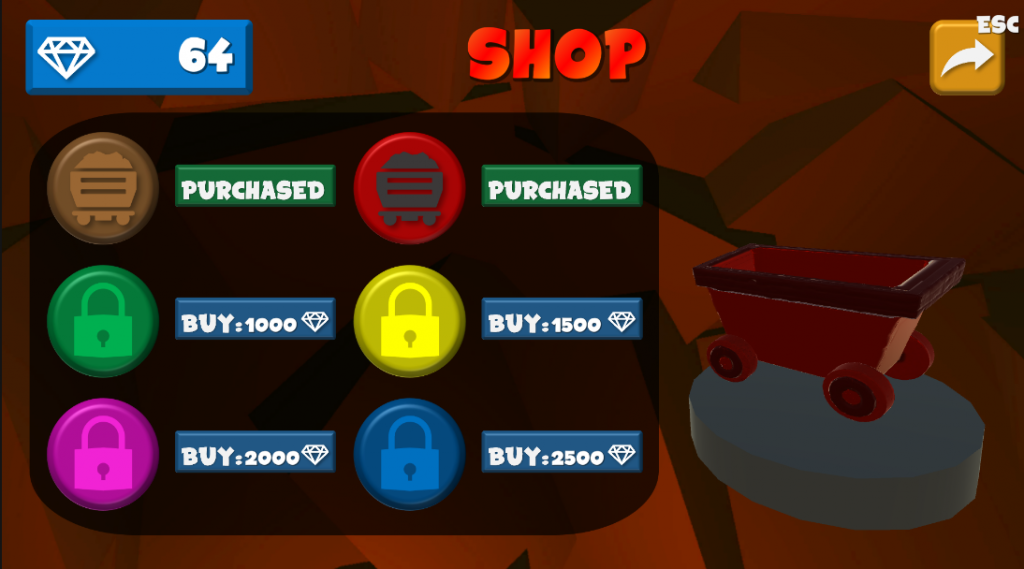
Final Result
Overall, I was super happy with how the UI for Lava Rama turned out, especially since this was my first time designing UI and creating UI art. However, after reflection, I realized there were definitely areas that I could improve upon.
Achievements
- First-ever UI design
- Mobile game UI
- UI suited in-game art style
Shortcomings
- Lack of wireframing
- No PC & mobile UI separation
- Colour inconsistencies